Form
Forms allow users to provide information, complete tasks, or submit requests.
// import the components for form pattern as required

import { Form, FormActions, FormControl, FormSection, FormSectionDescription, FormSectionHeading } from '@twilio-paste/core/form';
import { Callout, CalloutHeading, CalloutList, CalloutListItem, CalloutText } from '@twilio-paste/core/callout';
import { Select, Option } from '@twilio-paste/core/select';
import { Separator } from '@twilio-paste/core/separator';
import { useUID, useUIDSeed } from '@twilio-paste/core/uid-library';
import { Label } from '@twilio-paste/core/label';
import { Input } from '@twilio-paste/core/input';
import { Paragraph } from '@twilio-paste/core/paragraph';
import { HelpText } from '@twilio-paste/core/help-text';
import { Button } from '@twilio-paste/core/button';
import { ButtonGroup } from '@twilio-paste/core/button-group';
import { Text } from '@twilio-paste/core/text';
import { Anchor } from '@twilio-paste/core/anchor';
import { Box } from '@twilio-paste/core/box';
import { Modal, ModalBody, ModalFooter, ModalFooterActions, ModalHeader, ModalHeading } from "@twilio-paste/core/modal";
import { ErrorMessage } from '@hookform/error-message';
import { useForm, useFormState, UseFormRegister } from 'react-hook-form';
Use forms to present input fields, selection options, and actions in a clear, accessible, and logical flow, ensuring users can easily understand, complete, and submit their information.
A form can be:
- Simple and user-oriented like survey forms, login form, or a contact form.
- A complex and feature-driven form like settings, and multi-step forms spread across multiple screens.
Before designing a form you should:
- Think about the user’s relationship with the product.
- Understand the user’s goals associated with the form.
- Identify essential data needed to achieve your goals. Then, consider the optional data that would be helpful if available but are not critical to the form's success.
- Communicate the outcome of completing the form so users know what to expect once they submit it.
- Don't ask for the same information twice in the same session. Reference: WCAG
- Provide accessible error identification and messaging. Reference: WCAG
- Group related fields using fieldsets and legends with `FormSection` and `FormSectionHeading` from the Form layout component, which render an HTML fieldset and legend. Reference: WebAIM
- The order in which form elements are presented on a webpage should be logical and meaningful. Reference: WCAG
Check accessibility for each form element component—for example, follow Time Picker accessibility guidelines. You can also refer to the WCAG Forms Tutorial for more details.
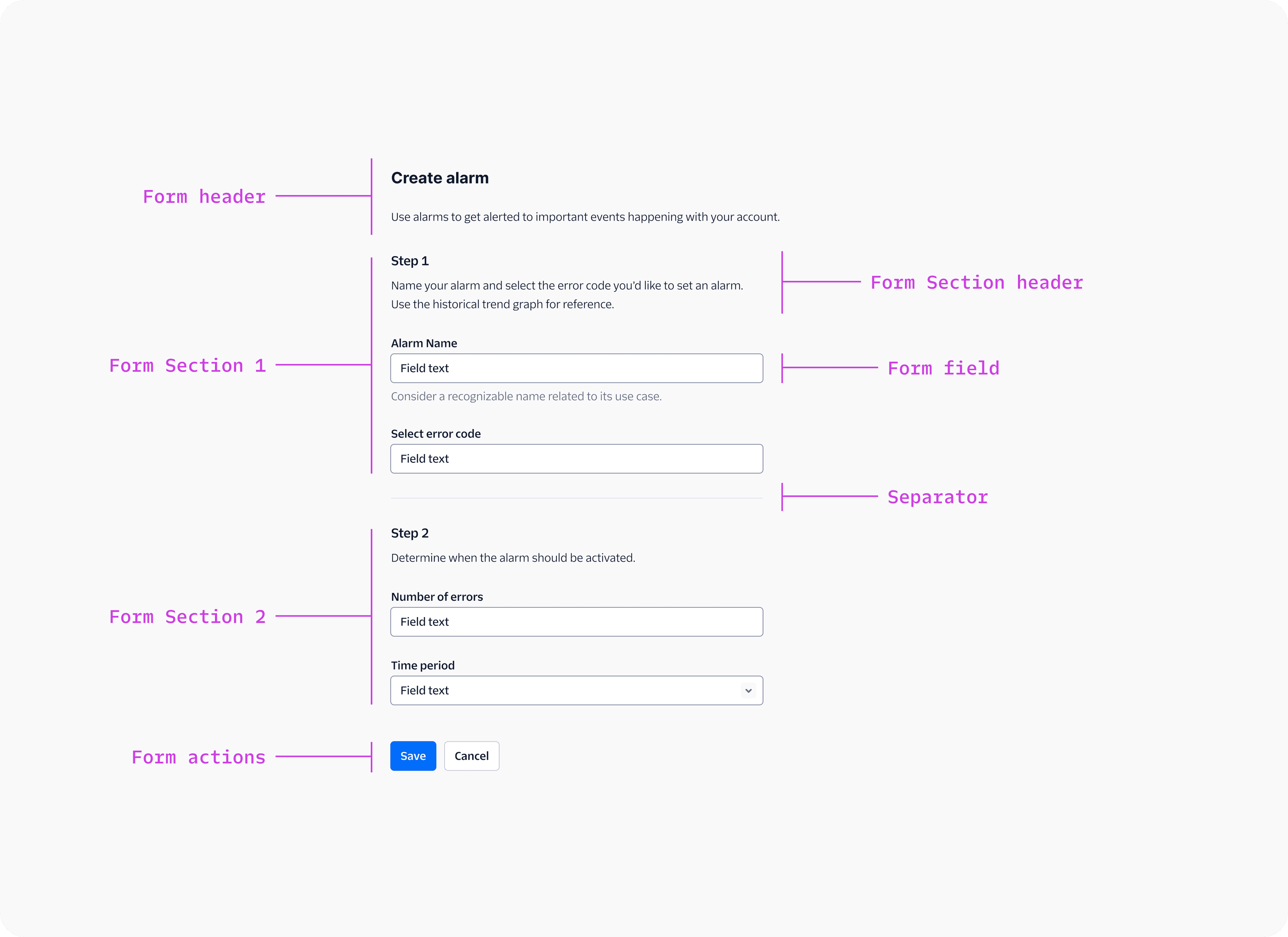
The different parts of a form are:
- Form layout component: A wrapper layout component that sets layout and spacing between form elements.
- Form element: Any UI component in a form. Examples: Input, Button, Callout.
- Form header: Includes form elements like Heading and Paragraph that describe the purpose of the form.
- Form field: A UI component in a form where users enter information, including their associated Label and Help Text. Examples: Checkbox, Input, Time Picker—with their Label and Help Text.
- Form actions: Includes form elements like Button or Button Group for submitting or navigating a form.
| Component | When to use |
|---|---|
| Form layout | Arranges a layout of form elements with preset spacing. |
| Heading and Paragraph | Explains the purpose of the form or form section. |
| Label | Provides a visible and accessible name to a form field. |
| Help Text | Helps users prevent an error and describe what makes the form field successful. It also includes error, warning, and success variants to communicate different states on a field. |
| Button or Button Group | Triggers actions and submits forms. |
| Callout | Summarizes errors or other important information in the header. |
| Component | When to use |
|---|---|
| Input or Textarea | Use Input for single-line text input and Textarea for multi-line text input. |
| Checkbox or Switch | Use a Checkbox to enable binary choices that require a submit action. Use a Switch for immediate binary on/off choices that don’t require a submit action and applies the user's choice instantly. |
| File Picker | Allows the user to upload only one file at a time. |
| File Uploader | Allows the user to upload multiple files. |
| Component | When to use |
|---|---|
| Radio Group or Radio Button Group or Visual Picker Radio | Use for up to 6 fixed list items and when only one selection is allowed. |
| Select or Singleselect Combobox | Use for 6+ fixed list items and when only one selection is allowed. By default, use Select. |
| Singleselect Combobox - Autocomplete | Use for lists with 15+ options or when users need to search a database to select one option. |
| Component | When to use |
|---|---|
| Checkbox Group or Visual Picker Checkbox | Use for up to 6 fixed list items and when multiple selection is allowed. |
| Multiselect Combobox | Use for 6+ fixed list items and when multiple selection is allowed. |
| Form Pill Group | Use when you’re editing a collection of data within a form. |
| Component | When to use |
|---|---|
| Slider | Use it when the exact value doesn’t matter. |
| Input with number functionality | Use it when the exact numeric value matters. |
| Date Picker | Use it for selecting specific dates. |
| Date Range Picker | Use it for selecting date ranges. |
| Time Picker | Use it for selecting specific times. |
| Time Range Picker | Use it for selecting time ranges. |
A single-step form presents all elements on one page, allowing users to fill out and submit the form in one continuous action.
Use single-step forms for:
- Tasks that users can complete in one go without interruptions or needing external references.
- Low cognitive load forms that require a maximum of 8 fields. For longer forms, use a Multi-step form or for settings, use the Settings template and divide the fields with In Page Navigation or Tabs.
A multi-step form divides the input process into stages, allowing users to complete one section of fields at a time.
Use multi-step forms when:
- Tasks require a lot of information (example: account creation, application forms, or surveys.)
- Some fields depend on previous answers.
- The data being collected can be grouped into distinct sections (example: personal information, preferences, payment details)
- Helping users focus on one task at a time.
Use the Wizard template for designing multi-step forms.
Adding a rough time estimate in multi-step form can be helpful as it sets clear expectations and reduces uncertainty for long forms.
Interruptive forms use a Modal, Alert Dialog, or Side Modal as a page overlay that collects user input and blocks interaction with the page until the form is submitted or the modal is dismissed.
Use interruptive forms:
- For brief interruptions where user input is required, but the interaction is short enough that the user retains context from their previous task.
- When users need to confirm an action before proceeding, such as deleting an account or submitting a payment.
- When the form doesn’t require leaving the page or referencing background content.
Avoid long/multi-step forms inside modals unless absolutely necessary. If a multi-step form inside a modal is needed:
- Avoid using progress indicators.
- Ensure that it’s a form that needs to be shown across multiple user flows. For example, phone number provisioning flows are in Modals because they can be launched from multiple touchpoints.
- Plan for scalability and consider how the form may evolve over time. If the form is likely to get more complex over time, put the form on the page instead.
Users may lose progress by clicking outside or pressing "Esc." Use the Confirmation pattern before closing the form.
Contextual forms use our Side Panel component and are primarily used on pages using the Filter pattern when there are too many filter options to display on the page. Use Contextual forms if the form is something users might interact with while still needing visibility of the background content (e.g., adjusting settings, applying filters, or configuring options without losing context).
export const MoreFilterPatternExample = ({data, filterList}): React.ReactNode => {
  const [selectedFilters, setSelectedFilters] = React.useState({});
  const pillState = useFormPillState();
  const [filteredTableData, setFilteredTableData] = React.useState(data);
  return (
    <>
      <SidePanelContainer id={sidePanelId} isOpen={isOpen} setIsOpen={setIsOpen}>
        <SidePanel>
          <SidePanelHeader>
            <Heading as="h3" variant="heading30">
              More filters
            </Heading>
          </SidePanelHeader>
          <Separator orientation="horizontal" verticalSpacing="space0" />
          <SidePanelBody>
            <Box
              display="flex"
              flexDirection="column"
              rowGap="space40"
              marginTop="space70"
              marginBottom="space70"
              width="100%"
            >
              {filterList.map((filter) => {
                return (
                <Disclosure>
                  <DisclosureHeading as="h2" variant="heading50">
                    <Box display="flex" justifyContent="space-between" alignItems="center" columnGap="space20" width="100%">
                      <Box as="span">{filter.label}</Box>
                        {selectedCount ? (
                          <Badge as="span" variant="neutral_counter" size="small">
                            Selected {filter.type === "status" ? 1 : selectedCount}
                          </Badge>
                        ) : null}
                      </Box>
                  </DisclosureHeading>
                  <DisclosureContent>
                    <FilterComponent
                      key={filter.label}
                      label={filter.label}
                      items={filter.items}
                      setSelectedCount={setSelectedCount}
                      setSelectedMoreFilters={setSelectedMoreFilters}
                      selectedMoreFilters={tempSelectedMoreFilters}
                    />
                  </DisclosureContent>
                </Disclosure>
                );
              })}
            </Box>
          </SidePanelBody>
          <SidePanelFooter>
            <ButtonGroup>
              <Button
                variant="primary"
                onClick={() => {
                  // Apply filters
                }}
              >
                Apply
              </Button>
              <Button
                variant="secondary"
                onClick={() => {
                  // Clear all filters
                }}
              >
                Clear all
              </Button>
            </ButtonGroup>
          </SidePanelFooter>
        </SidePanel>
        <SidePanelPushContentWrapper>
        // Filter components from other examples
        </SidePanelPushContentWrapper>
      </SidePanelContainer>
    </>
  )
}
Inline forms use our Popover component. Use Inline forms when the input is optional and concise. Popovers work best for lightweight interactions that don’t disrupt the user’s primary workflow.
Designing a good form requires making decisions about composition, sequence, form elements, copy, and feedback. Use the Form layout component to arrange a layout of form elements with preset spacing.
The process of completing forms should be as simple as possible. Take the time to evaluate every field you add to your forms. Before adding form elements, ask yourself:
- Do you really need to ask for this information?
- Is it information that you can get automatically?
- Can we prepopulate the field from data we already have from a user?
- Is there a better time or place to get an answer from our users?
Each question in a Web form has a cost…If there are too many questions in the form, you’ll lose users…if there are questions in the form that users consider impertinent or irrelevant—or, even worse, you’ll get made-up data.
— Caroline Jarrett, The Question Protocol: How to Make Sure Every Form Field Is Necessary
Don’t make the user repeat information. For example, if the shipping and billing addresses are the same, provide an option to reuse the shipping address instead of requiring duplicate input.
When ordering your form, place fields in a logical order from a user’s perspective, not the application or database’s logic. For example, it’s unusual to ask for someone’s address before their name.
The order of questions in your form should, as closely as possible, match the way things flow in the user’s mind.
— Jessica Enders, Designing UX Forms
After determining the number of form fields, decide how to group them into sections, using FormSection from the Form layout component. If a form naturally breaks down into short sections, a single step form is likely to be a good way to organize the form. When a form becomes long and has more than 8 questions that are only related by a few topics, multi-step form would be a better way to organize the form.
Keep forms left-aligned to improve scannability and help users quickly understand the required information. This also makes it easier for keyboard users to tab through fields.
Ensure that field lengths provide both:
- Meaningful affordances that help people answer questions.
- Enough room for inputs across multiple languages.
For example, a “Zip code” field can be size-20 in width because it’s not expected to maintain a small content length across languages. However a “Destination name” field should stretch to the max width you’ve defined on your content area. Refer to page templates for suggested max widths based on the type of page you’re building.
Make required and optional fields distinguishable in the Label. Try to avoid optional input fields in forms.
- If most of the inputs on a form are required, indicate only the few that are optional.
- If most of the inputs on a form are optional, indicate only the few that are required.
If you use the required prop to indicate required fields, you'll see a "Required" title on the symbol. If you're building for other languages, use the i18nLabel prop to translate the "Required" title.
Use Help Text to help users prevent an error and describe what makes the form field successful. Include examples to show the expected format (example: "Example: 123-456-7890" for phone numbers)
Avoid placeholder text. It is not broadly supported by assistive technologies, does not display in older browsers, and disappears from the field when a user enters text.
Non-PII (Non-Personally Identifiable Information) fields, especially Friendly name Inputs, require us to inform users when they might accidentally input sensitive information. These fields are marked as “Not PII” in the Twilio API, and require a visible representation in the UI.
Check out to the Privacy pattern for more information.
Conditional fields in forms appear to users based on their previous interactions or choices.
When using conditional fields:
- Limit nesting to one level deep. If a conditional field reveals another conditional field (and so on), it can make a form unpredictable and harder to complete.
- If more than 3 fields need to be conditionally displayed, consider moving them to the next step of the multi-step form.
- Ensure users understand why new fields appear.
- Ensure that the revealed conditional field remains on the same page for user reference to previously selected fields and within the recommended field limit for a single page.
- Use primary Buttons for key actions like Submit, Save, or Next, helping users complete the form and secondary Buttons for actions like Back or Cancel.
- When a user is submitting a form, use the format “[Verb] [Object]”. For example, “Add funds” or “Update credit card”.
The primary Button placement depends on the form type:
- For Single Step Forms, Side Modals, Side Panels, Minimizable Dialogs and Popover forms, keep the primary button left-aligned, and placed before secondary buttons for better scannability of the content and its related actions.
- For Multi-step Forms and Wizards, keep the primary button right-aligned, placed after secondary buttons to indicate the direction of the form. Refer to our Wizards action footer guidelines for additional guidance.
Most form validation should occur after a user presses the submit button.
- Don't prevent form submission by disabling the submit button. Assistive technologies cannot detect disabled buttons. Use error messages to explain what information is missing or incorrect.
- Disable the primary action button only if you need to prevent duplicate form submissions, or you clearly explain what a user needs to do before submitting the form.
- If it’s going to take a while to process a form, communicate this to the user with feedback messages and progress indicators (For example, use a loading Button).
Inline validation, either on blur or while typing, should be used rarely. It can be frustrating to users who tab through controls to navigate a page, and to screen reader users, who might not be able to detect that an error occurred on-blur.
If you absolutely need to validate inline:
- Use inline validation only where immediate feedback helps, like creating passwords.
- If validation fails, do not display an error message while the user is typing. Keep the form field in a neutral state and consider using a checklist-style inline validation that marks rules as complete as the user types.
- Use positive inline validation once the user has entered the data again.
Use an error Callout to communicate errors for a particular section of a page, or that applies to the whole page. Within the Callout, list errored fields as anchors and shift focus to the first errored field in the form. For additional guidance on how to compose error messages, refer to the error state pattern.
- Use the Confirmation pattern for critical, infrequent, and possibly destructive actions. For frequent actions, use the after deletion pattern and offer a way to undo the action in the success message instead.
- If a user needs to agree to Terms of Service or similar, use Checkbox Disclaimer
- If the user needs to review multiple answers, show a full page with the question asked, answer they gave, and allow them to change their answer, if they need to.
Clearly communicate when a form has been completed successfully and what happened as a result using success messages with the Toast component.
Refer to our Notifications and feedback pattern for additional guidance on processing states of different complexity and emotional levels in forms.
Further reading on forms best practices.
- Kathryn Whitenton, Website Form Usability: Top 10 Recommendations (Nielsen Norman Group)
- Katie Sherwin, Placeholders in Form Fields are Harmful (Nielsen Norman Group, 2014)
- Andrew Coyle, Design Better Forms (UX Collective, 2016)
- Adam Silver, Form Design: From zero to hero all in one blog post (2019)
- Luke Wroblewski, Web Form Design: Filling in the blanks (2008)